INVESTMENT BANKING

The Problem
Earlier the organization was having the support team to address the needs of the users and organization. The Client has requested to reduce the manual effort and provide us the one stop solution.
The Solution
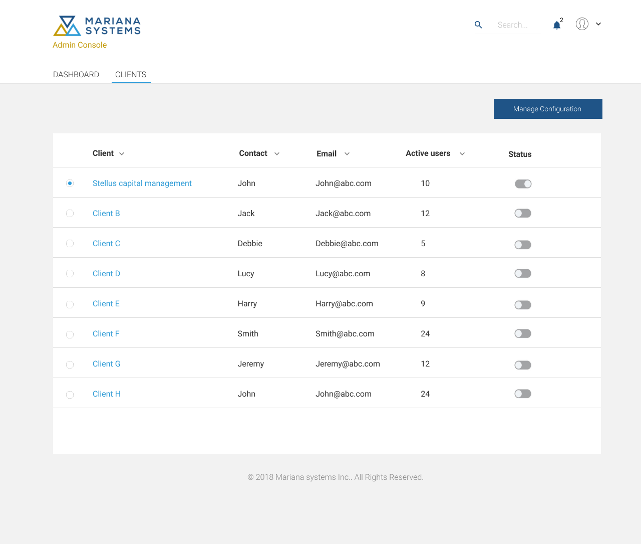
Designing admin console was provided as a simplified administration solution which makes it easier to manage controls within the workspace. The Admin Console is the one-stop shop for administrators to manage their organization's software and users. This allows for the management of preferences, user information, and settings. The goal was to design an Admin Console with information architecture, easy navigation, modern, and scalable for future additions.


The Design Process
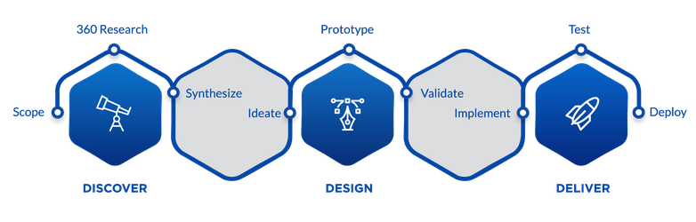
In Discover phase, we gather and understand requirements by brainstorming and in-depth interviews with stakeholders – clients, product managers; strive to understand user problems and needs by ways of user testing and focus group discussions and competitive research.
In the design phase, we analyze the data collected during the discovery phase, make inferences from ‘what’ to ‘why’. We ideate by ways of quick sketches, wire-frames, and interactive prototypes which, we use to validate by user testing.
In the deliver phase, we help implement the designs that we made and validated, test the design in UAT, and raise request for fixes if the designs are not proper. It is a process which loops for every new feature and enhancement.
Information Architecture:
When interacting with any digital service the user builds a mental map. This map should answer how to implement a particular scenario, where to look for information, and what opportunities the service provides. The basis here is the navigation and the information blocks of the service. It is necessary to base information architecture on a user’s existing cognitive patterns to make it clear and predictable. The Card Sorting identification method really comes in handy here. All the elements and the service functions should be logically grouped for a user based on the cognitive patterns.
Navigation Design:
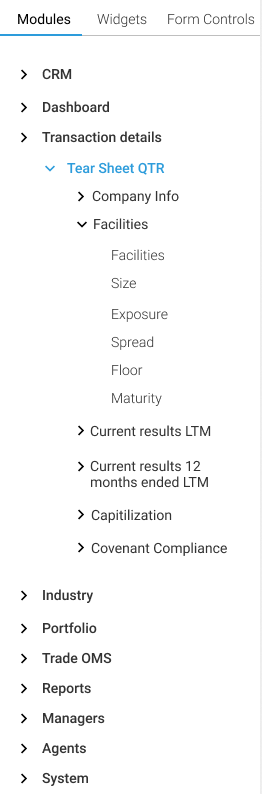
The main site navigation (left menu) has been placed on the left side (primary optical area) of all pages. The main site navigation provides visual indication of where a user is currently located on the menu, with the ability to quickly switch to other menu items. The left menu system is always open to make it simple and increases efficiency. We have arrived at the present grouping of modules based on the card sorting exercise. Gestalts principles of grouping are used in this application. The design layout also follows the same pattern for easy navigation.
The Approach:
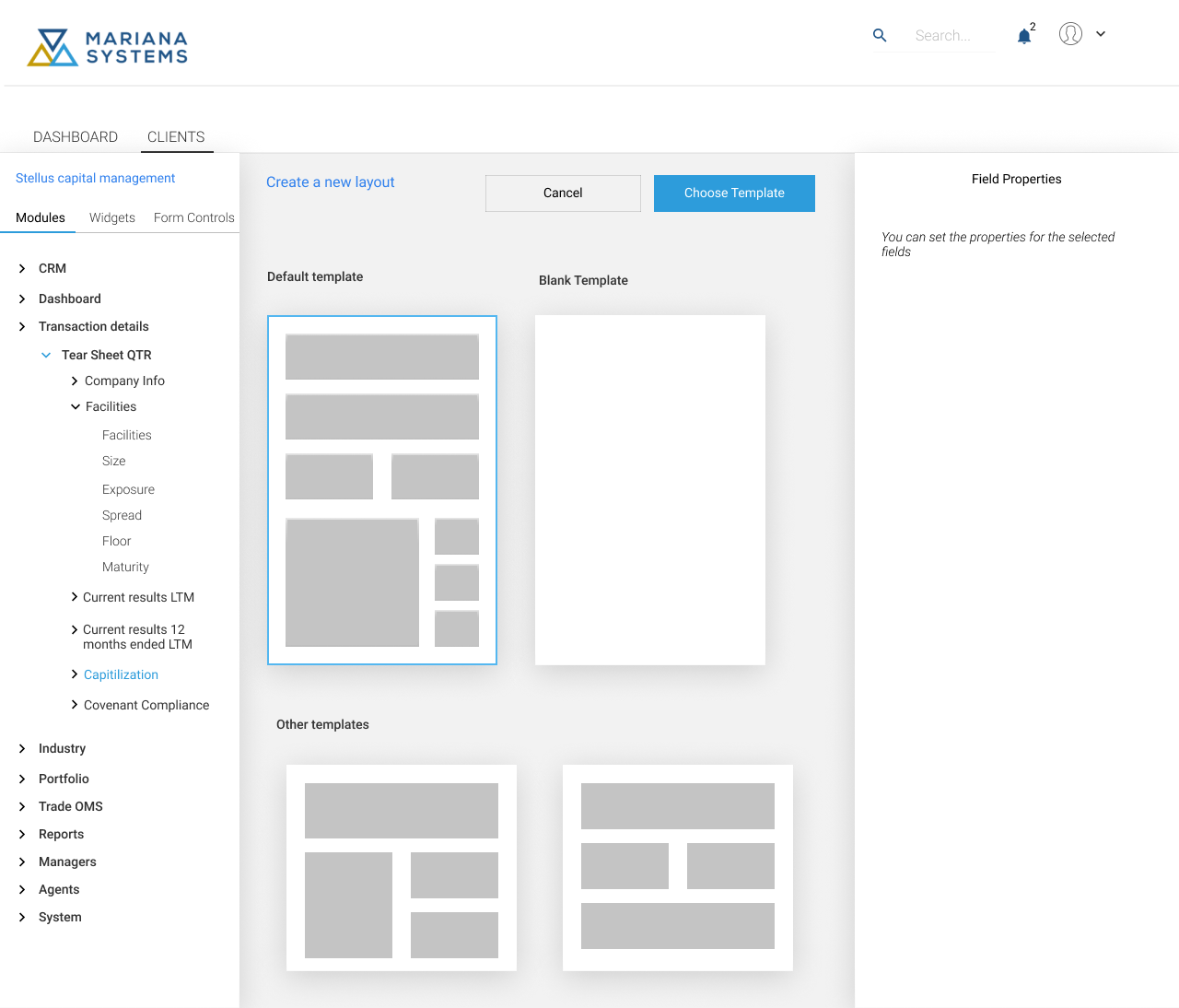
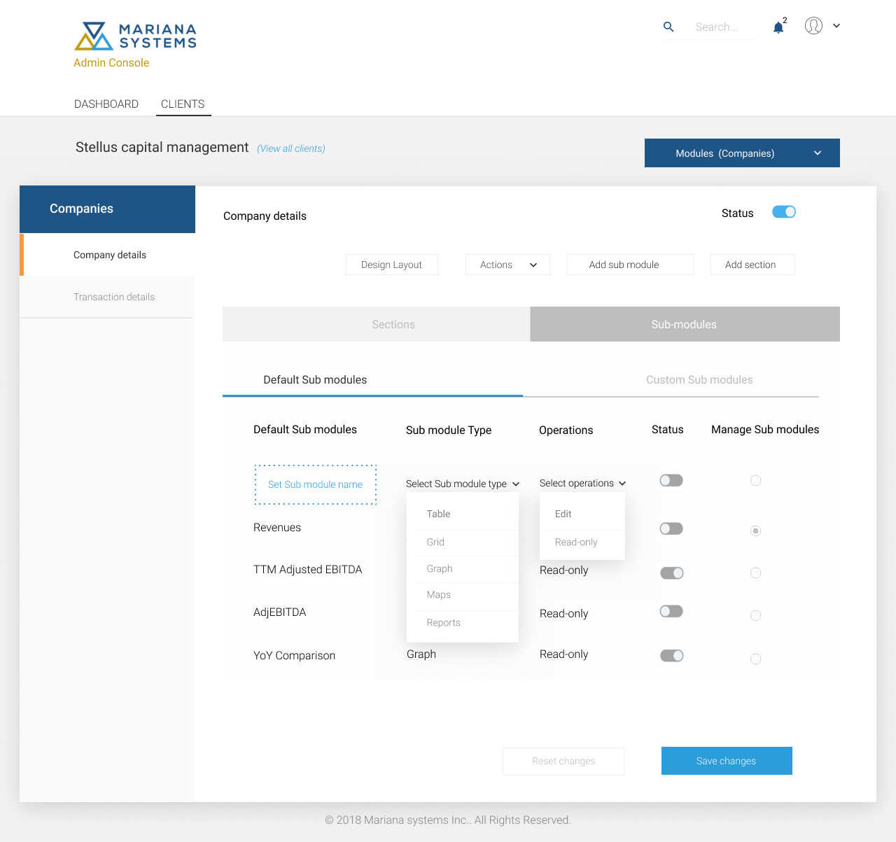
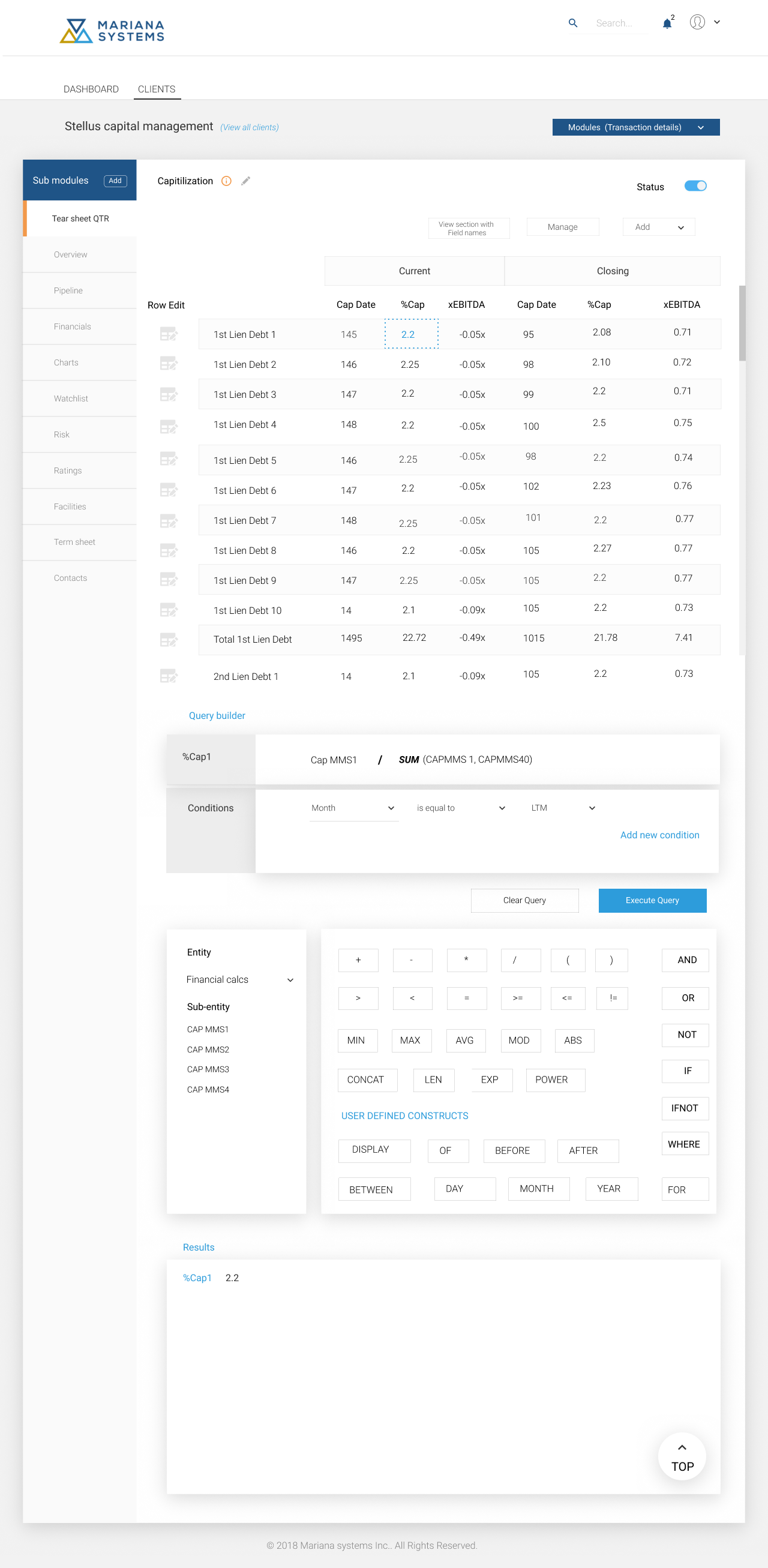
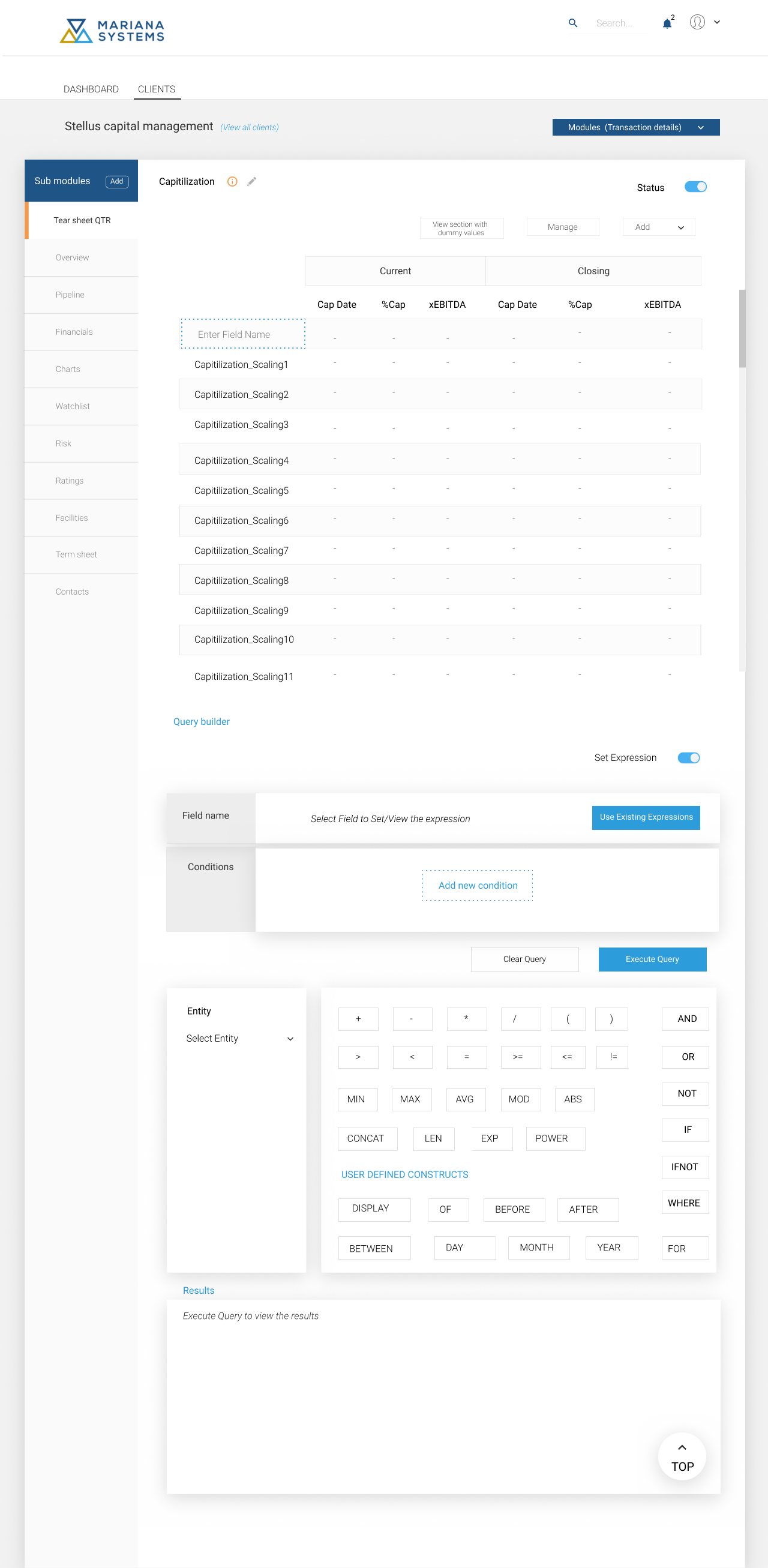
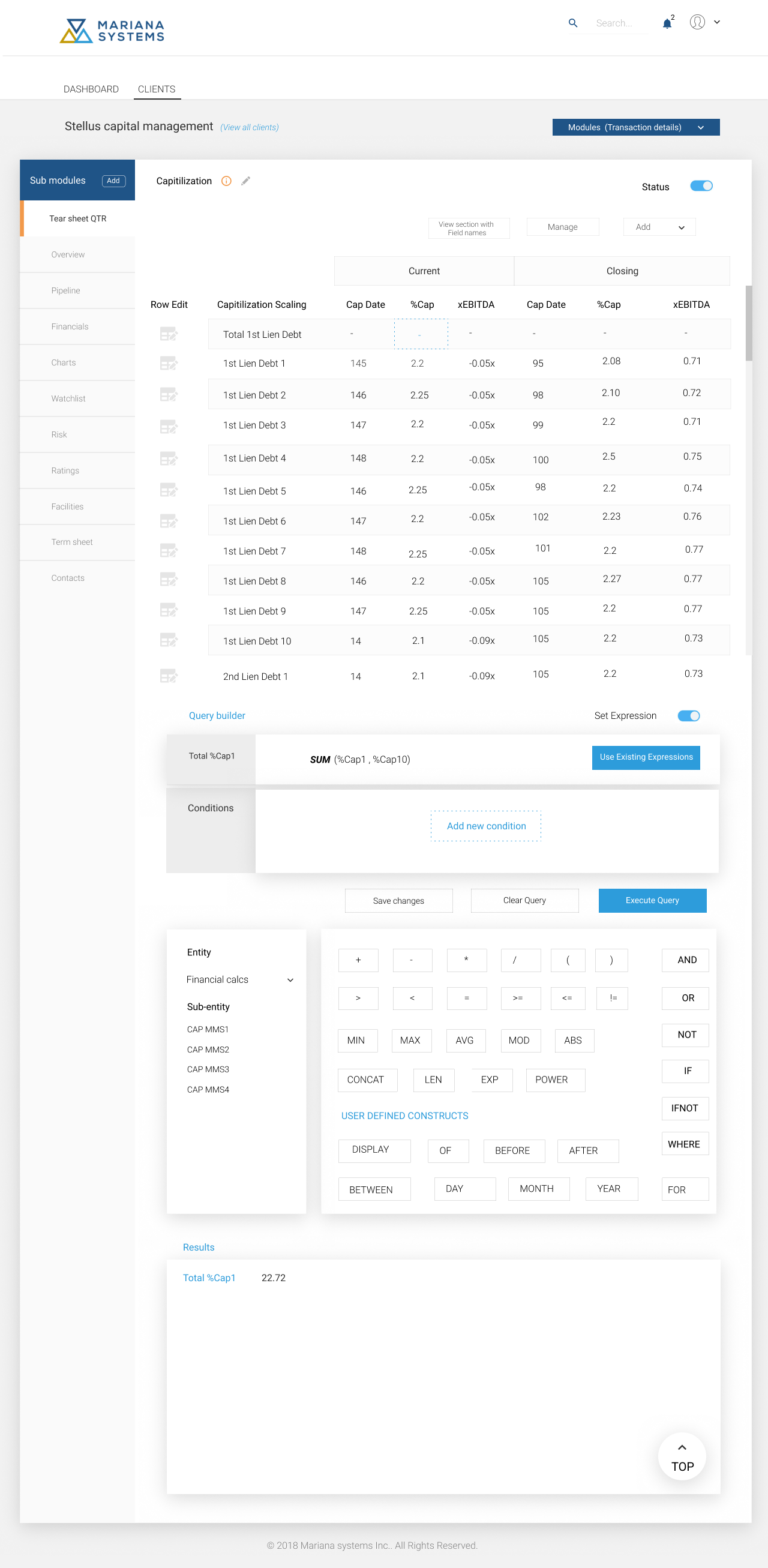
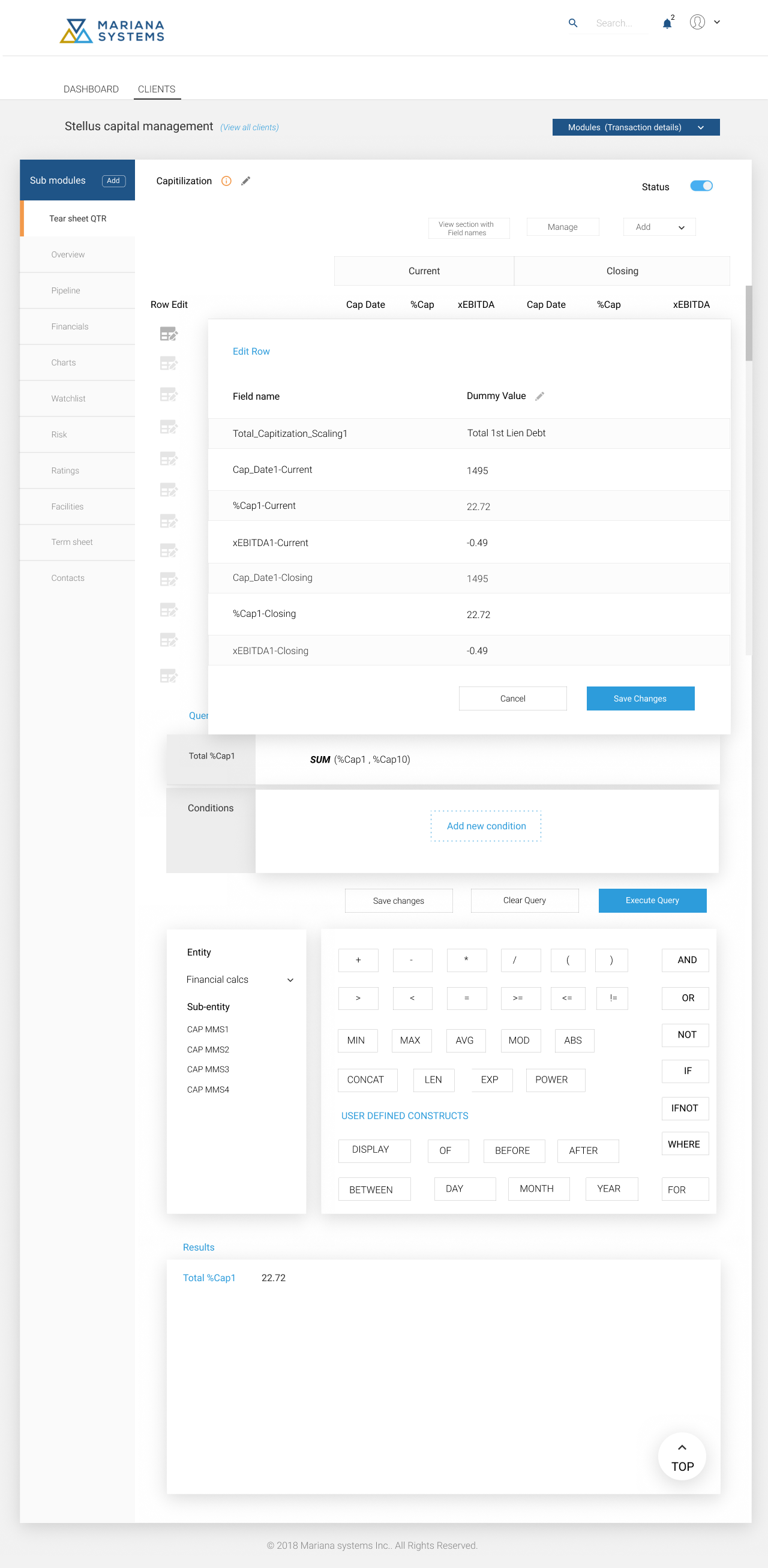
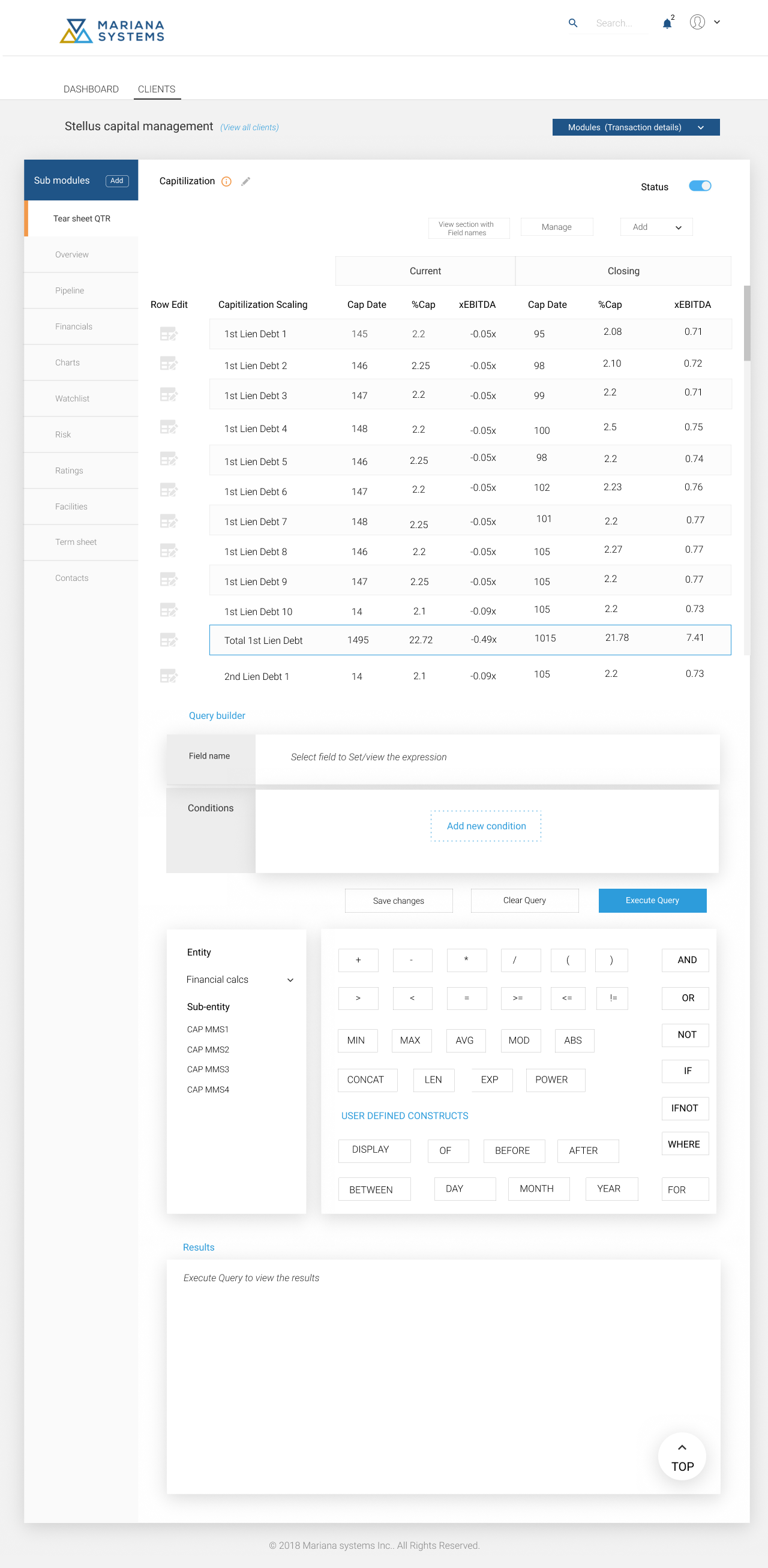
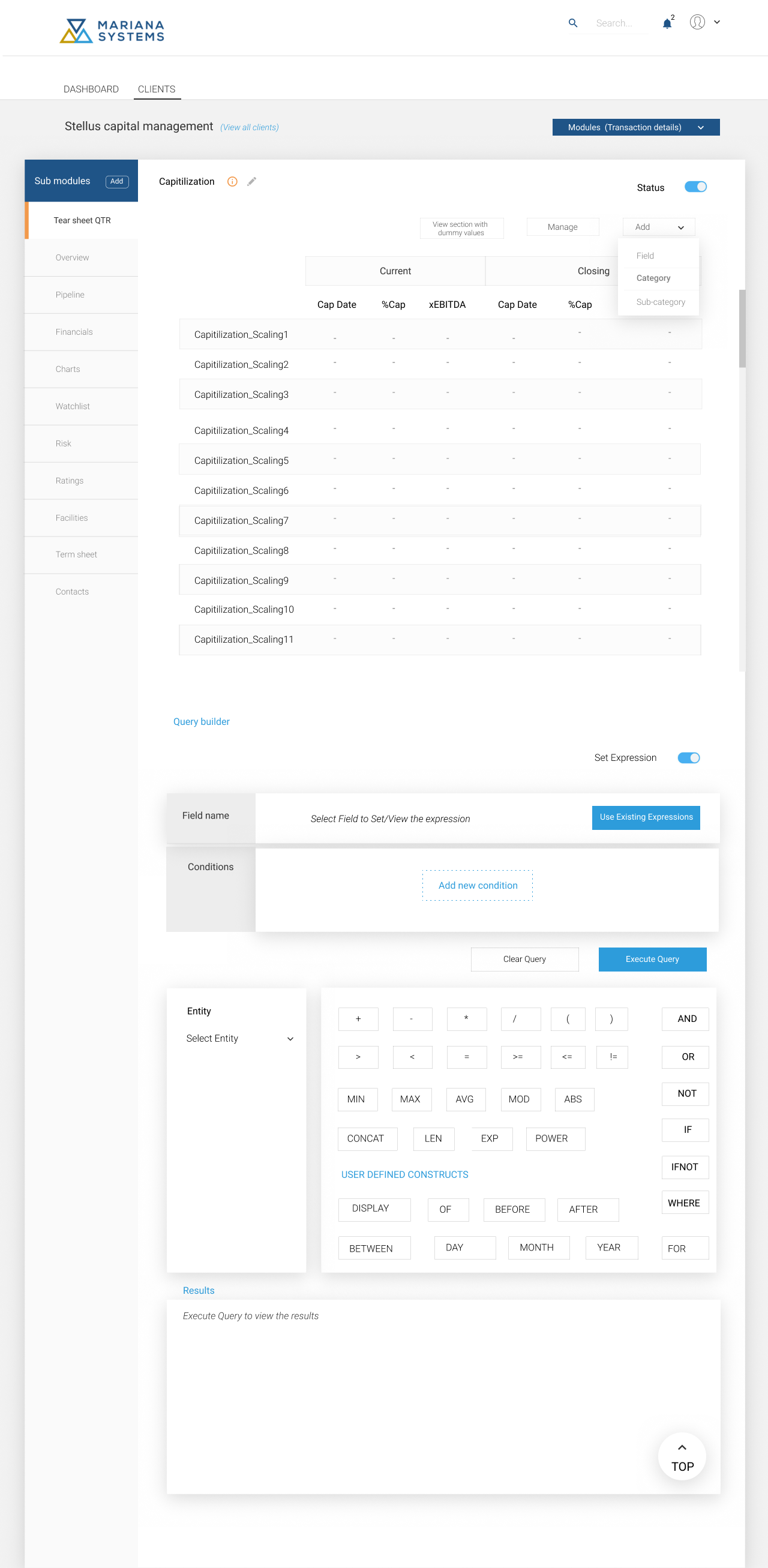
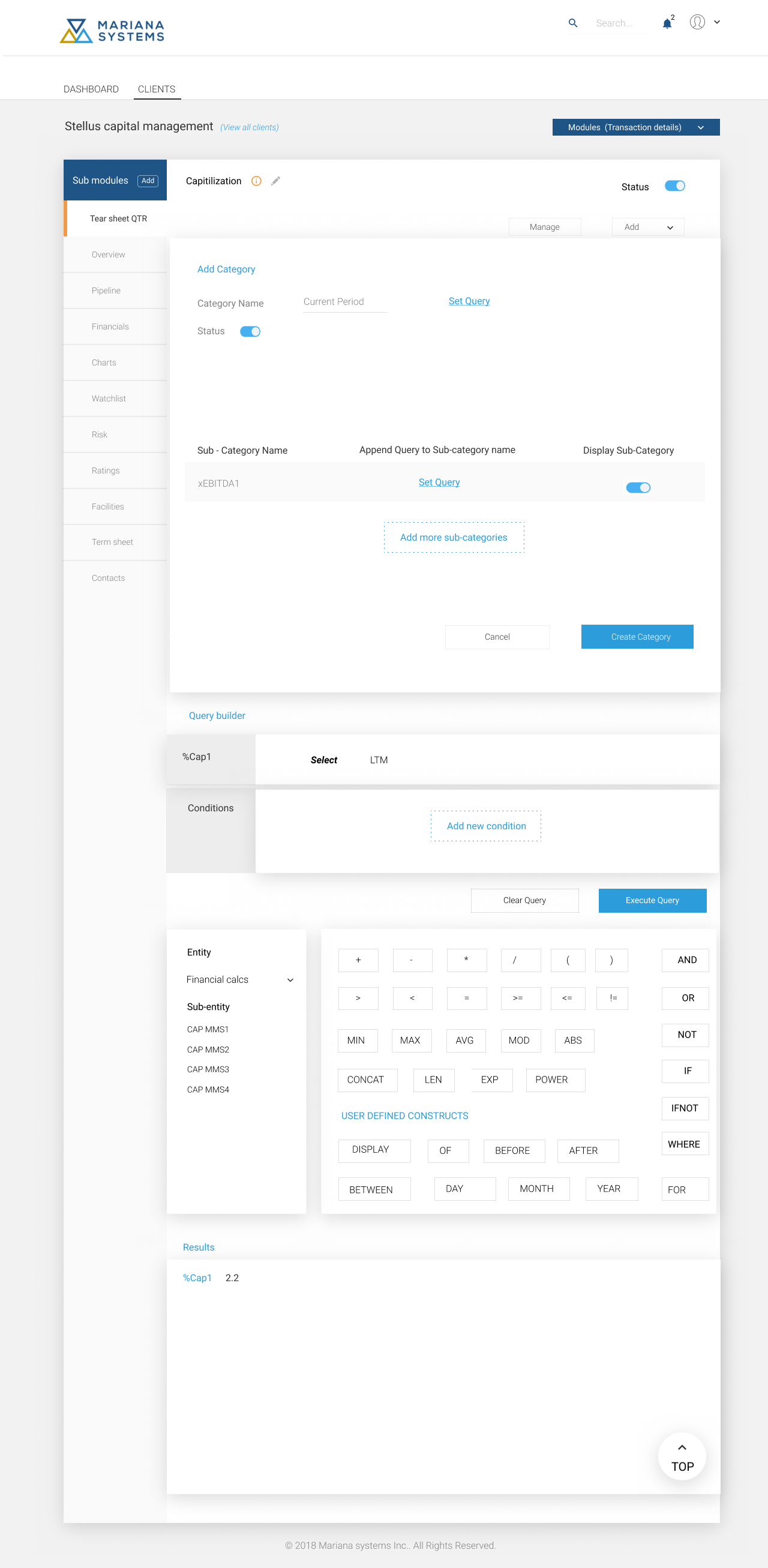
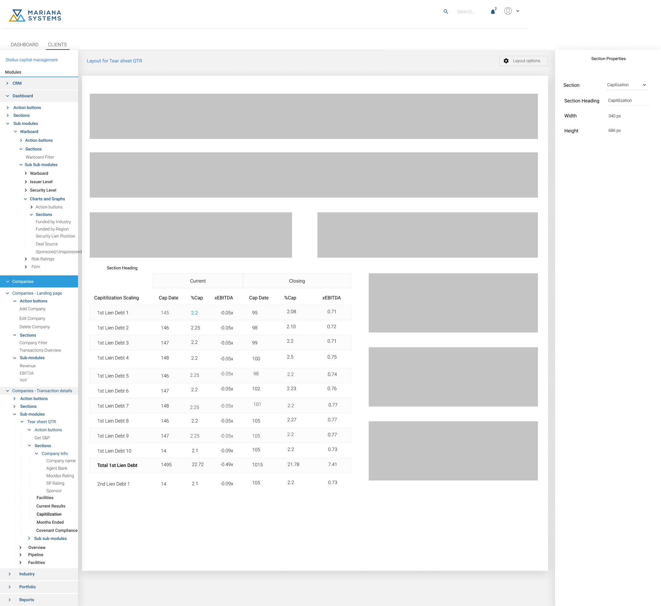
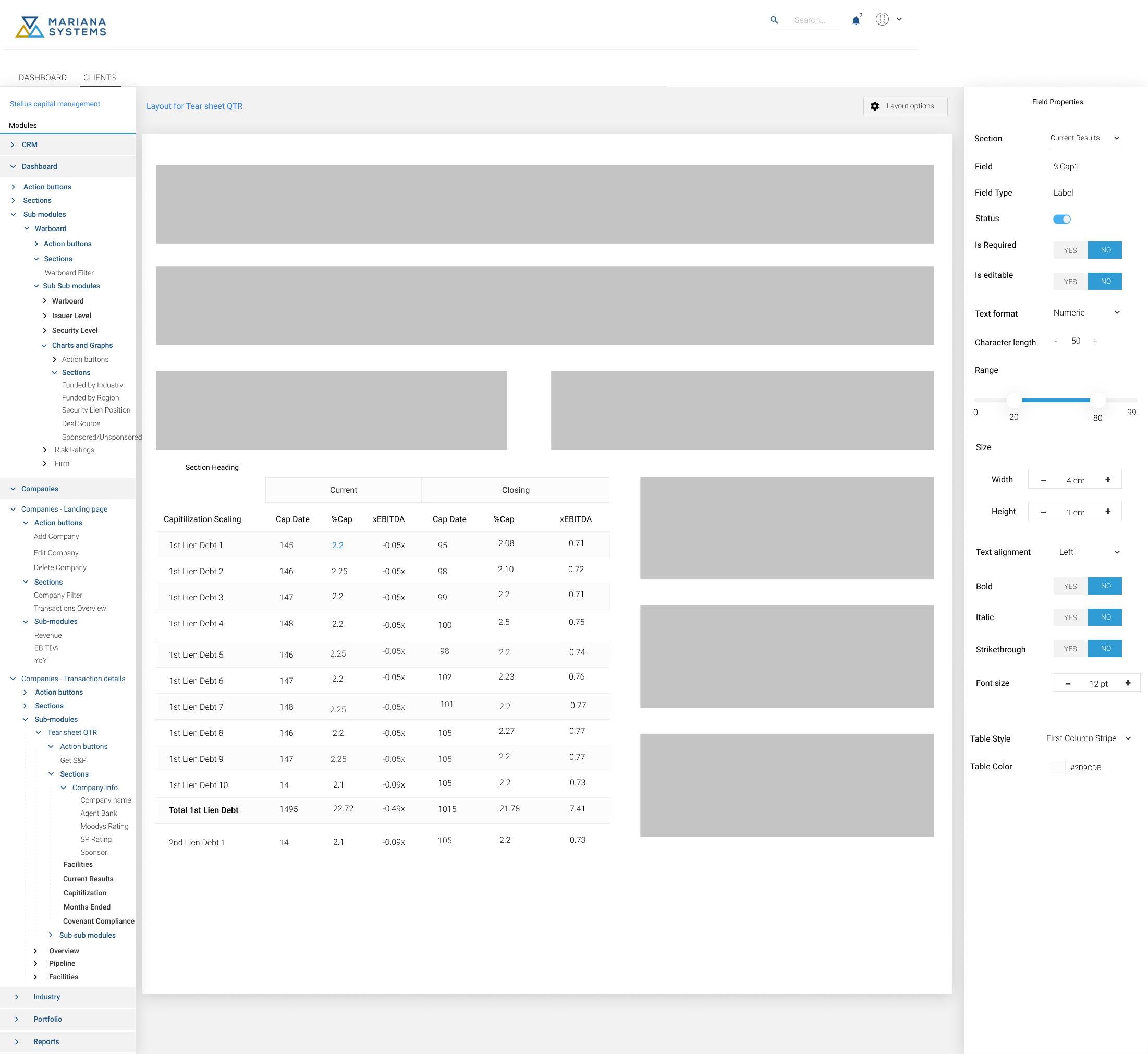
I have started with the stakeholder interview to understand the business and the user needs. Common terminologies were arrived for categorizing the application map. A module could have more than one sub-modules. Each sub-module is treated as a page. Each page will have sections and each section will have its own fields. The page layout has been defined using these terminologies (Refer below figure).
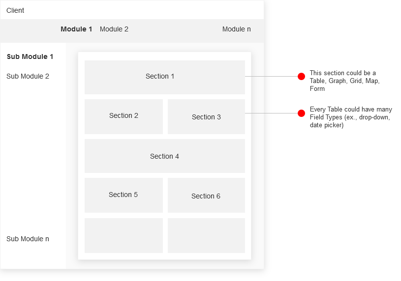
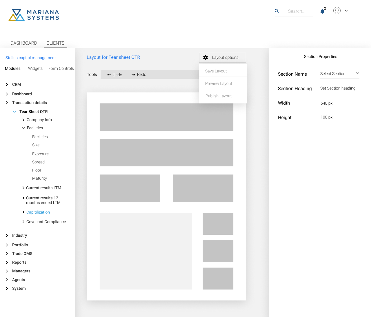
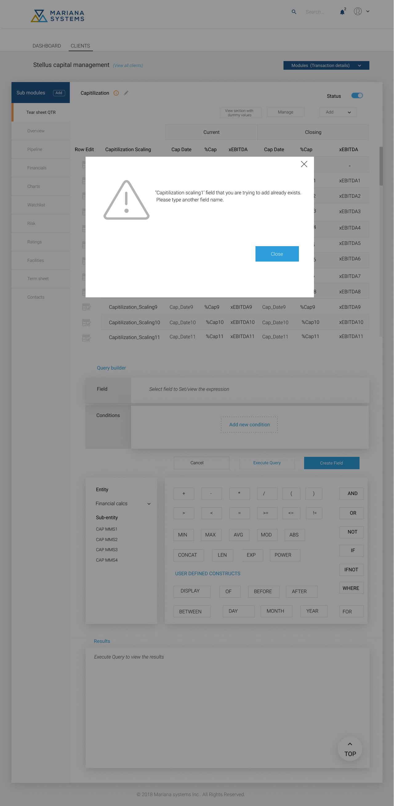
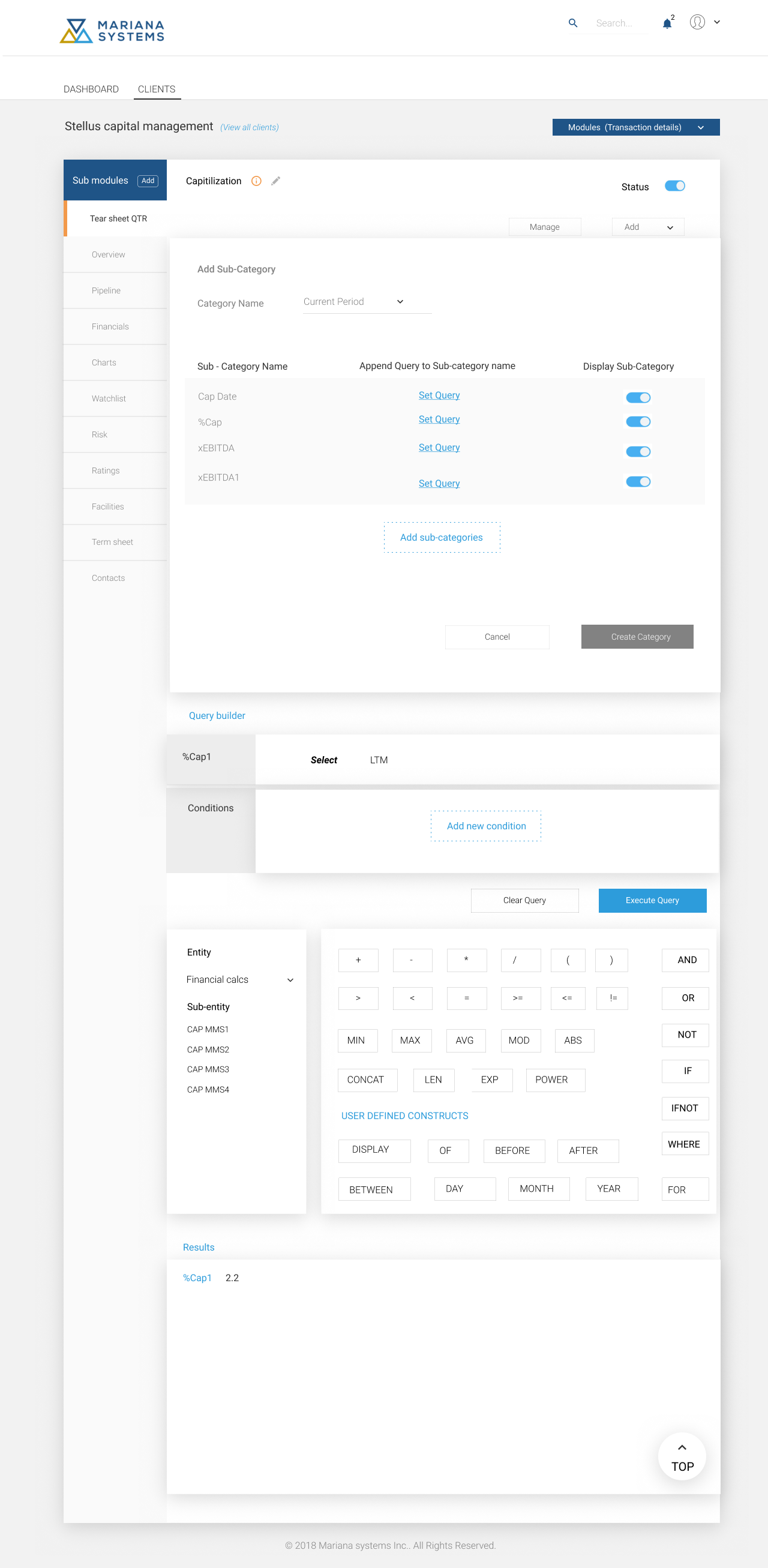
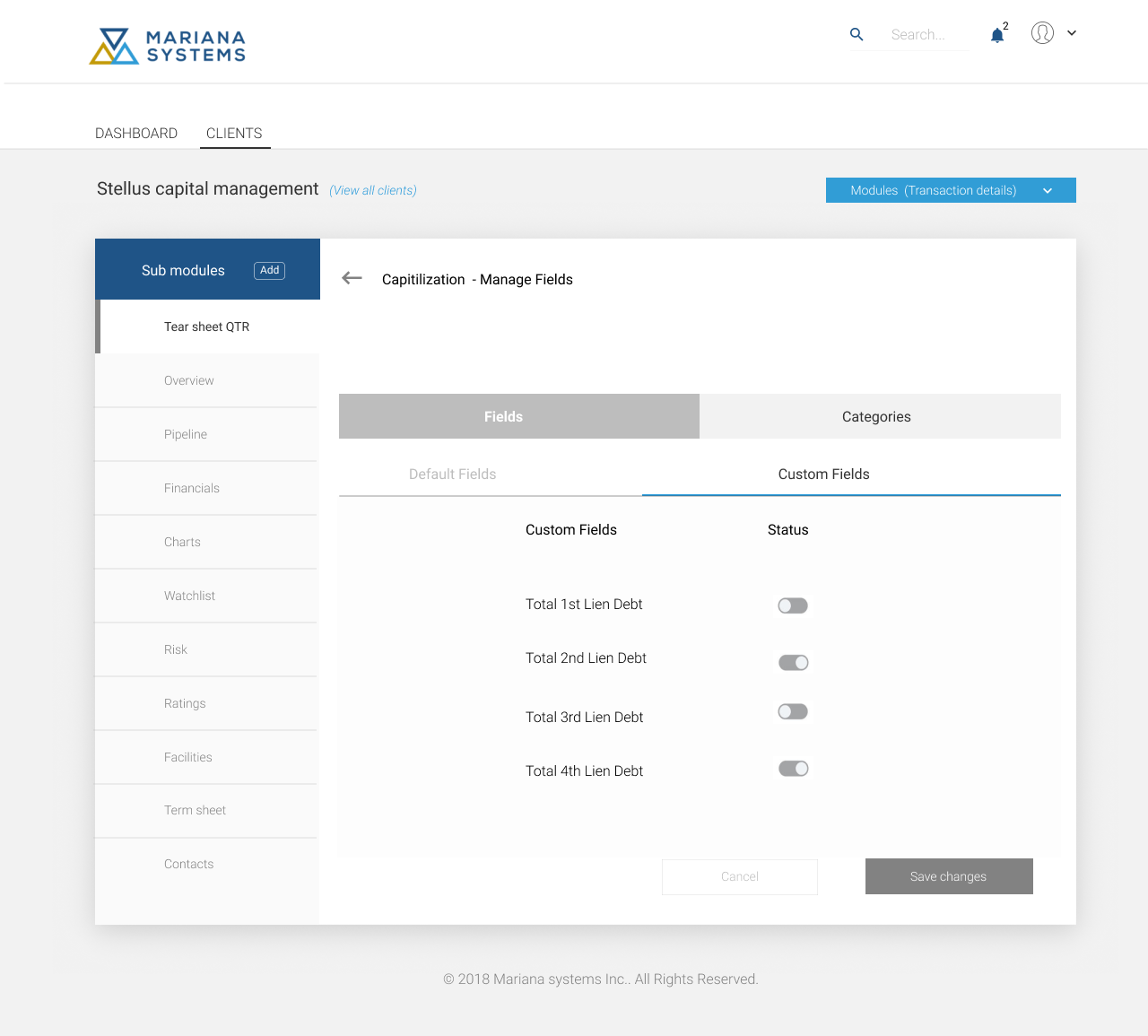
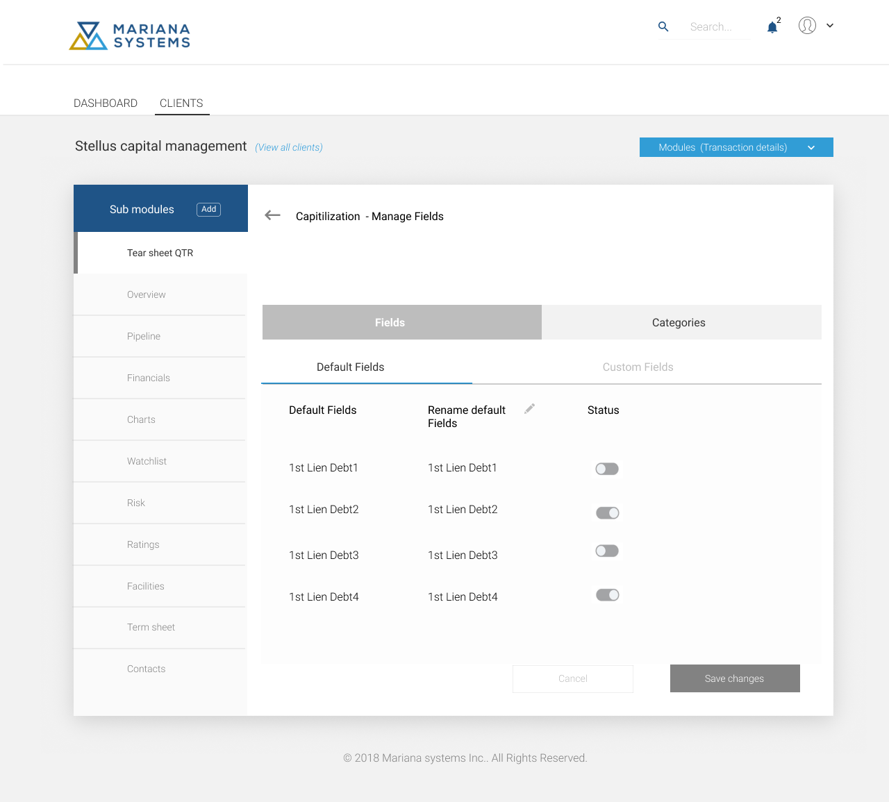
The section type consists of Table, Grid, Graph, Map and Reports. CRUD operations include Edit and read-only. For example, I wish to add a capitalization table to 'Tear sheet QTR' sub module. The process started with configuring the section type (ex., table) with fields (rows) & categories (columns) and set the query for the same. Once the configuration has been finished, the layout will be defined. The design layout is a three column layout with modules/sub-modules and sections on the left pane; layout in the middle pane and property settings on the right pane. One can select the respective section/field and apply the properties to it. The user could preview the changes saved to the layout. When published, the changes will be reflected in the actual application. Proposed designs were validated with users for key tasks with Click-through prototype of the designed application.
Admin console consists of:
- Design console menu bar (File Menu, Edit Menu, Toolbar Menu and Help Menu)
- Design console explorer (Modules and sub modules associated)
- Design console workspace (configuring modules/sub-modules/sections and associated fields)
- Design Layout (designing page layout)
- User management: (Assign new administrator roles, allow different employees access to specific tasks within the Admin console, and provide certain levels of access to key users in your team)